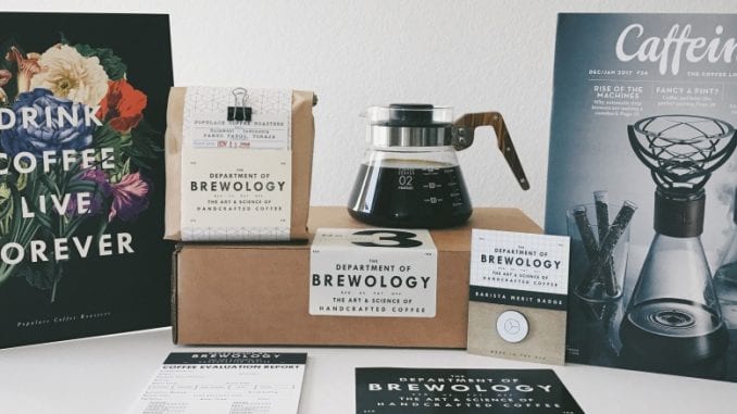
The Department of Brewology designs beautiful coffee products, from bags to prints to pins. The duo behind the design team talk to us about their beginnings, future projects, and the intersection of coffee and design.
Ashley Rodriguez: I tried to do some research on you, but not really a whole lot about you two online. What are your backgrounds and how do they fit into coffee?
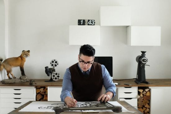
David Salinas: I started as a Barista back in 1998 at a local shop in South Texas. I worked up the chain and eventually landed in management working a few other shops. Eventually I started building up my design clientele and transitioned out of coffee by 2003.
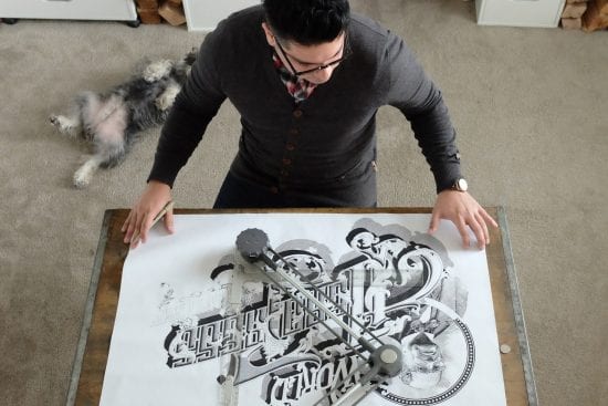
Over a decade after I hung up my barista apron I began to pine for it more and more. In my spare time, I started to play around design ideas I had regarding coffee with really no intention to do anything with it. Eventually, I came up with an illustration of a Chemex that was composed of typography; I posted it on Instagram…I don’t know why. To my surprise there was quite a bit of positive feedback; I was startled. People emailed & DM’d me inquiring if I’d ever produce it as print for them to own.
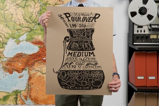
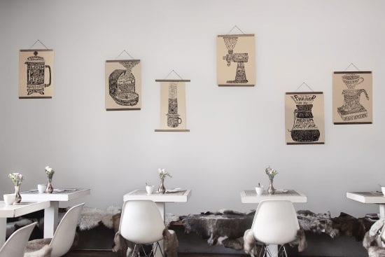
I shied away from the idea until I received an email from Benn Crawford of Coffee Supreme in New Zealand. He graciously encouraged me to produce it as a print and further develop it as a series. It was then that I started to take it seriously. So I took the plunge and went for it. The kindness of people saved me. The print was well received and soon after I developed a ten part series, exploring a number of brewing devices. Globally, to this day we ship this series on a weekly basis. People believed in me…I am forever grateful.
Brett Cannon: David and I went back as far as the 90’s as amateur concert promoters and stayed in touch over the years. I was one of the early people that commented on his original Instagram post because I was a huge lover of coffee, but also a huge print collector. I probably own 200-300 screen prints that I store in a flat file. I have a marketing and business background, so I approached David about expanding his spare time designs into a bigger business. He’s really the heart and soul of Department of Brewology, where I oversee a lot of the operations and day-to-day boring stuff. David always has a lot of wild ideas, and it’s my job to figure out how we execute it, basically.
Ashley: How do you pick and decide on projects?
David: Having the unique perspective of being an observer and fan of the specialty coffee industry, we look for things that specifically don’t exist that we wished existed. Filling the void is usually the first criteria for any new project. We strive to bring something new to the industry as opposed to replicating something someone else already did. It’s important to introduce something new with meaningful functionality and good aesthetic value with a purpose for the actual design being a primary objective.
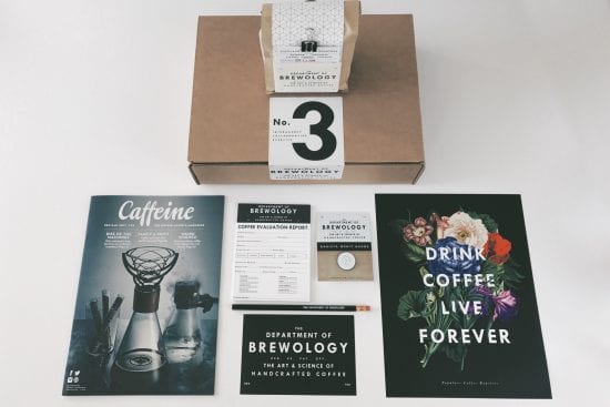
Brett: I would also add that it gives a whole other dimension to the customer experience. There are so many coffee subscription services out there, and you get a box with some coffee in it and that’s fine. Which is why we didn’t want to do a coffee subscription service—we wanted to do something that was a whole curated and crafted experience between your favorite roaster and us. Where, when you open this box, it really takes you to a different place.
Ashley: How does design influence coffee? What are some things to be mindful of when designing products for coffee?
David: I believe coffee brands that utilize design successfully are cognizant of the importance that design brings to a brand and the consumer experience. For those of us who have enjoyed the vast spectrum of enjoyment found in coffee, it’s incumbent upon us to give proper context to that experience when introducing it to a new audience. Proper visual cues are of utmost importance when introducing these ideas. I believe design could be the perfect vehicle by which we convey this context. Too often brands miss this opportunity. I can’t tell you how many AMAZING coffees I’ve had packaged in poor design…it’s a travesty. Most consumers are unconsciously expecting to be led into a brand experience, seeking visual cues. In my opinion, some of the best coffee companies know and wield this dynamic.
Ashley: Are there norms and customs in coffee design that make you cringe?
David: What makes me cringe is how often design ideas can be quite inbred within the specialty market. Unfortunately, what tends to occur within the industry is that we draw influence quite frequently from our direct competitors and eventually we all end up looking the same. This is a lazy and unethical approach. It’s always refreshing when a brand draws influence from an outside source and brings in something new and invigorating.
Ashley: I’ve been sort of obsessed with designing a better coffee bag label. How would you approach this?
David: Over the last few years I’ve had the opportunity to work with a good number of roasters designing their packaging and in that time I’ve witnessed a steady growth in retail packaging capabilities. Ten years ago it’d be more than suffice to simply have a label on a 12-ounce bag but now more often you’ll see roasters utilize every square inch of the bag. I remember first seeing this and loving the idea of being able to print on virtually any panel including the inside of the bag and it is still quite neat but like every trend in design some novelties can wear thin. I’m definitely not saying that this trend is a bad thing or that an all-over print can’t still be rather beautiful but I once heard James Hoffmann say (paraphrasing), “the rise of technology and the ubiquitous nature of all things digital only makes the simplest things all the more impactful.” So I am rather curious to see how things might eventually trend backwards to simpler motifs where less is more and minimalism is favored over densely designed aesthetics.
One thing is for sure, this last decade has definitely witnessed a more fervent embrace of all things design within the specialty coffee industry and that’s a REALLY good thing. Apart from developing something thematically cohesive it was my goal to design something that stood in stark contrast to most that’s on the market. It had to be something multifaceted, interactive and engaging. Touching back on Hoffmann’s theory of the surplus of new technology creating a demand for old technology I thought incorporating a string tie closure was a nice archaic element to include. In a time when packaging has grown increasingly mass produced and disconnect, I hoped to capitalize on that vacuum and create something that’s thoughtfully comprised of handmade elements with an understated minimalism that boasts nothing of itself but rather points to the coffee.
In other words I wasn’t interested in printing a design on a package but rather create a package that was the design, hopefully I was successful at doing that. The process of assembly is rather exhaustive, it’s comprised of plenty of hole punching, hand stamping, cutting folding, tying, clamping…it’s entirely analog. My hope is that the extensive, thoughtful, hand approach process is evident and memorable to any one that encounters it…and most of all I really hope they enjoy it.
Ashley: What does the future look like?
David: We’re about to work on a new print series exploring the Coffee Varieties. This time we’ll have the honor of working directly with World Coffee Research. They’ll be providing a wealth of data on each Variety coupled with our botanical illustrations; we’re quite excited about this new series. Due to popular demand we’re also exploring the idea of expanding our Bloom print series. We’ve also had such a massive response from our Boxset Series, we’ve already started working on and getting samples from roasters for Sequence 3.
Ashley: What do you want people to know about you?
David: At our core, we’re simply big fans of the specialty coffee industry and the space being made for new ideas and approaches. To us it’s exciting to be part of an industry that is eager to grow.
