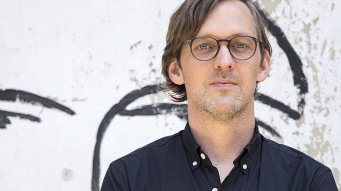
Go Get Em Tiger’s Director of Store Design Joseph Wedding and Co-Owner Kyle Glanville talk about what drives the company’s iconic store designs and the benefits of having an in-house design team.
BY VALORIE CLARK
SPECIAL TO BARISTA MAGAZINE ONLINE
Photos courtesy of Go Get Em Tiger
Joseph (Joe) Wedding is a trained architect who works exclusively with Los Angeles-based coffee company Go Get Em Tiger. In a sea of new Los Angeles cafés, the company has remained dedicated to serving delicious coffee—now roasting their own beans—and expanding locations; Gget currently has six spaces, with an upcoming shop in Culver City, Calif., soon. Joe has led the design of the company’s two most recent Downtown L.A. cafes, and will take charge of the Culver City location too. In this interview with Joe and Kyle Glanville, Go Get Em Tiger’s co-owner, we talk about the design process, inspirations, and the benefits of working with one consistent in-house team.
This interview has been edited and condensed for clarity.
Valorie Clark: Joe, how did you get into coffee? Have you ever been a barista?
Joe: Never been a barista. I came in kind of blind. But one of my first projects (as an architect) was working on an Intelligentsia café, which is where I met Charles (Babinski) and Kyle (Glanville). That’s how I was introduced; I didn’t know anything about coffee before that. I have a master’s degree in Architecture from RISD. I’d say most of my professional work has been more focused on interior design. A lot of it went toward the sale of coffee—retail coffee, bars, things like that. Coffee has been a part of my professional architecture practice for a while.
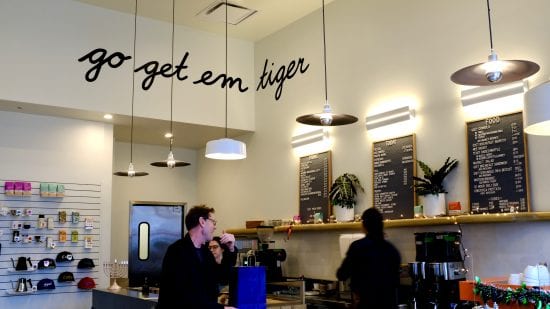
I did get the abbreviated version of the training process that every barista that’s hired at Go Get Em goes through. Kyle was very adamant when I started that I do that training, and it was a huge help. I even worked at shift at G&B, and it was the first time I’d ever worked a service shift before.
Kyle: All new hires go through barista training no matter where they’re working. Everybody should understand what we’re here to do. With Joe it was more on-the-nose-obvious because he was going to be designing the work spaces, and so he needs to understand the why behind those design choices. That’s been my frustration working with designers who are not internal, historically, because they don’t understand the roots, so they can’t help you iterate or innovate beyond telling them where to put things. We wanted Joe to have that complete toolbox.
What drove the layout and style of the two downtown cafés?
Joe: It’s a very big collaboration between a lot of people in the company. We try to integrate with a lot of people’s input in terms of the food, the flow, the space to make sure we’re hitting all the targets and crossing all the t’s and dotting all the i’s, so that when it’s handed off to the manager—someone who is probably coming from a different location—who can understand really quickly how service flows without making a cookie-cutter shop.
In terms of how the customer experience is done, I think there’s definitely something really important about the flow of service and how that is integrated so that (baristas) can move around from different shops and work and it should feel comfortable and easy. Every box we’re given is a different shape, but we try to make everything as integrated as possible. That’s what drives some of the early decisions in planning for how the major flow should work. It is function-driven a little bit more than an aesthetic mood.
Kyle: The way I characterize our shops is that we try to fit a size 10 business into a size 5 space. So we really have to plan down to the millimeter. Before we worked with Joe, and now even any time we work with different tradespeople like metalworkers, the thing everybody we work with on the design and construction of these pieces says is, “You guys really care about every centimeter of this space in a way that none of our other clients do.” And it’s true because if we can save a motion or save a turn or a step, and you multiply that by hundreds of times a day, and consequently thousands or hundreds of thousands of times a year, that’s the difference between serving everybody their drink right on time or taking a little bit too long or having a frustrated customer or a staff that feels totally wrecked after every shift. We do have to work—the function is first and foremost. We want our place to be non-stressful for everybody, and then we beautify.
What drove the color palette for the ROW shop?
Joe: I think we all agreed that some of the other shops we had done—even the 3rd Street shop—we tried to put a little color there, but it happened so fast that we didn’t really get to pull off as much as we wanted to. With the ROW we had more time to work on the design. We always felt that the other shops—even like the Larchmont store that I had done earlier—didn’t have a lot of color. It was something that we wanted to push even further. We got really cool materials that were in really great colors that we all agreed on, and it evolved that way. We really wanted to push having more textures, so we built the palette around that.
Did the history of the buildings in the ROW play into the design at all?
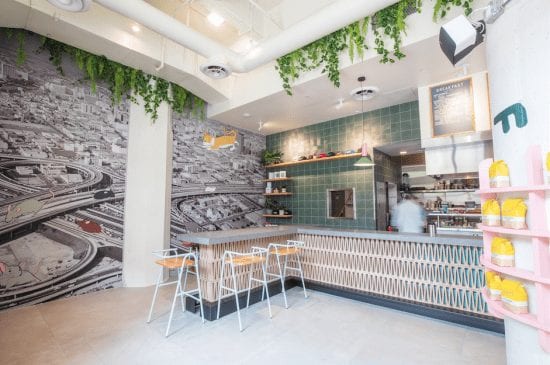
Joe: When we first started talking about that wall (the biggest in the shop, which features an aerial photo of Los Angeles overlaid by a cartoon cat chasing some mice), we wanted to do something impactful, something that was iconic of L.A. Iconic was one of the words we were looking at earlier on, with different architectural pieces, like some historically famous buildings to L.A. natives. We started looking into acquiring photos, then we found this image in the Library of Congress, which showed a nice shot of L.A. going through its development. It was taken right after they lifted the zoning regulation that restricted the building of anything taller than City Hall. We all felt that that black-and-white image that shows an older piece of L.A., though it doesn’t actually show the ROW, it captures some of that age and how the buildings evolved here in L.A. It’s a loose connection.
We’ll continue this conversation with Joe and Kyle in an article on Barista Magazine Online next week.

ABOUT THE AUTHOR
Valorie Clark (@TheValorieClark) is a freelance writer with a background in specialty coffee. She is based in Los Angeles.
