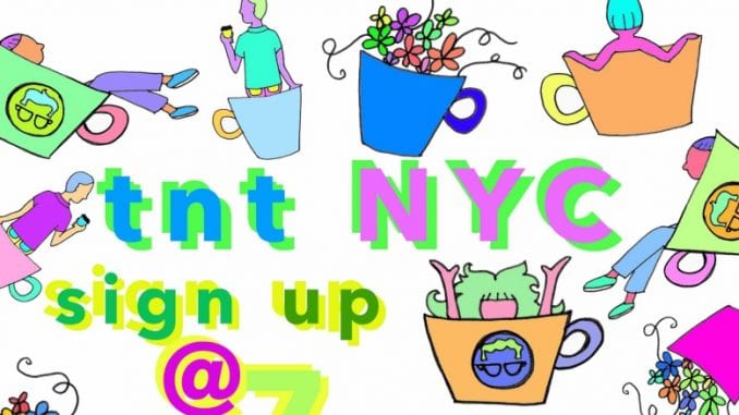
We make posters for everything—throwdowns, panels, events—but not all of them are good or sensitive to the diversity of the coffee community. We point out different ways to create more inclusive coffee posters.
BY BAILEY ARNOLD
SPECIAL TO BARISTA MAGAZINE
In specialty coffee in the United States, we talk a lot about community. Community can encapsulate a lot of arenas—among the team members in our shops, at our many coffee conferences, and at extracurricular events such as throwdowns. In our discussions on community in coffee, many of us champion inclusivity: We tend to be super proud of how progressive and accepting our industry is compared to the corporate world of spreadsheet formulas, Pink Oxford Shirt Wednesdays, and paid time off. But when we actually look at community in specialty coffee, what does it look like? Well, without sugarcoating things too much, it looks white, cisgendered, and typically male. It looks pretty normative, and pretty comfortable for those who fit into that normative picture.
There’s a lot to unpack and discuss when we discuss diversity in coffee—we need more of it, and there’s tons of work to be done in order to get us there. But what I’m going to focus on today is: representation in promotional materials for community events. You might think that promotional posters for events are just visual tools that outline the basic information of the event. And if you’re thinking that, you’ve probably never felt personally victimized or excluded by a coffee event poster. Representation is incredibly important—if you never see someone who looks like you doing the thing you want to do, you’re going to feel less confident about it and less inclined to get out there and do it, which ultimately just perpetuates the coffee status quo.
So let’s discuss a few different types of common coffee event posters out there and explore their merits and flaws. We’ll share ways you can design coffee posters that are more inclusive, less offensive, and speak to the entire coffee community.
- The poster that features solely or primarily white men
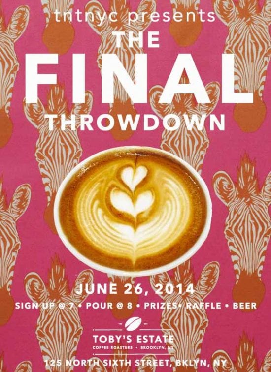
Here’s the thing about this one—people like people who look/think/talk/are like them. It’s called in-group bias. So the people who make the posters are white men, they make posters that feature white men, and then white men come to the events. Essentially, white men beget white men. And for the most part, this is unintentional—people don’t do this because they think, ‘You know what would really get someone to want to show up to this event? A bearded white dude with a neck tattoo on the poster. Yeah, that’s super creative!’ People do this because it makes sense to them, and no one has ever pointed out the fact that that may be problematic within the context of their greater coffee community. Even when it’s done as “satire” or to “poke fun,” or if there are a few POC, women, and/or queer folks in the background, it just continues to enable this epidemic.
- The poster that objectifies women
We’ve got some females on the poster? Sick! But hold up: Is her butt showing? Is that some side-boob I see? Is she basically just a prop or accessory? Is this the only version of women we get? Yes, it usually is. But it doesn’t have to be! And let me be clear, I’m 100 percent all for ladies and their bodies getting out there and getting it. But your coffee woman doesn’t need to constantly look like a coffee pinup girl. I don’t care if it’s like a cool vintage ad—vintage ads are typically regarded as trash. It’d be like us saying that old coffee brought to us in moldy shipping containers full of pests has merit. We know better now, so let’s not go backwards, okay? Next.
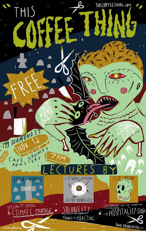
- The poster that is culturally insensitive
Coffee is an internationally traded commodity, so sometimes we include the art or aesthetics of other cultures within our promotional materials. If this is executed through the lens of cultural appreciation, or promoting an event that specifically involves the culture in question, this is typically fine. It’s encouraged, even. But if we’re talking about a Coachella-headdress, Gwen Stefani’s bindi, or Day-of-the-Dead-face-paint-on-Halloween-type situation, there’s a problem. You shouldn’t use the objects of other cultures in your design for no reason or just because you think it looks cute.
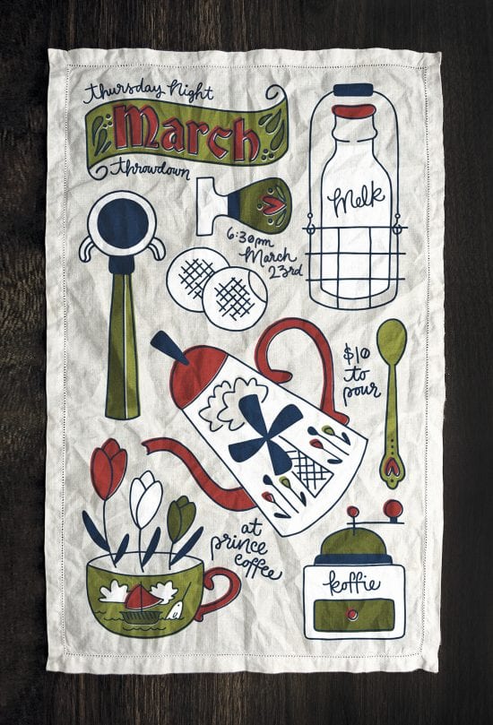
- The poster that mostly just utilizes print design
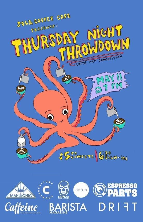
Shift in tone alert: This type of poster is typically pretty safe and great! In general, barring any subliminal messages, when someone utilizes print design to create an image, using minimal or no actual human figures at all, there’s a pretty good chance they’ll be able to create a beautiful image without marginalizing anyone at all. And even if there are human figures in the design, why not make them multi-colored? Multi-shaped, multi-sized, multi-hairstyled? The possibilities are endless!
So, if you’re going to go the route of having actual semi-realistic-looking people in your promotional materials for your event, they shouldn’t be the same colors, gender identities, and bodies we’ve seen over and over again. Making a poster is an artistic endeavor. It’s not like you’re limited by our industry either: In coffee there are people of color, women, queer folks, trans folks, and people who are differently abled, and there are all sorts of ways to depict all of these beautifully different humans in your event posters.
 ABOUT THE AUTHOR
Bailey Arnold is a former TNTNYC organizer, recent MANE presenter, and co-founder of the N.Y.-based lecture series This Coffee Thing. She is an unabashed proponent of creating and maintaining community in specialty coffee. You can find her leading trainings and setting and maintaining standards as the Director of Education for Gregorys Coffee in New York City.
