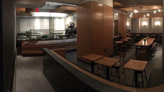
Walk into a cafe, and usually the last thing you notice is the layout—at least if the layout is done well. If not, it becomes the only thing you notice. We talk to architect Selim Vural about how he approaches the unique issues and problems that coffee shops face in terms of design and layout.
BY JOSHUA DUSK-PEEBLES
SPECIAL TO BARISTA MAGAZINE
Next time you go for a walk, or a ride, or a drive, take a few moments to look at the buildings you pass on your way. Chances are you might just find yourself fascinated by the details placed in or on the buildings around you. The plurality of intention and artistry that can be seen in houses, churches, and public buildings is truly impressive, especially because all we really need these structures to do is provide us with shelter and a few utilities. Yet, they also often provide us with beauty and inspiration.
This is not so very different from specialty coffee. At its most basic level, all we really need from coffee is a palatable boost of energy that doesn’t kill us. But it offers us so much more than that—nuance, complexity, sweetness, balance, and depth are all things we have come to admire and desire in our cups of “joe.”
It is really no surprise that these two attempts to elevate the basic human experience have begun to come together more often and more synergistically. Those drawn to specialty coffee are prime candidates for appreciating intentional design, given their penchant for engaging the connection between function and form.
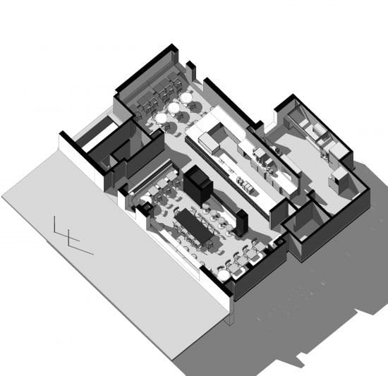
In places like New York City, architects like Selim Vural are delving even deeper into this type of design by reworking classic spaces so that they keep their original value while becoming more directly connected to their new purpose and style. Irving Farm Coffee Roasters‘ newest cafe, located in the Midtown East region of Manhattan, is housed in a classic pre-war building where Selim turned the historically low ceiling—which can easily create a heavy, dated, and dark room—into a positive feature by suspending a series of oaken boxes from the ceiling, covering the mechanical equipment, while also bringing warmth and layering to the space.
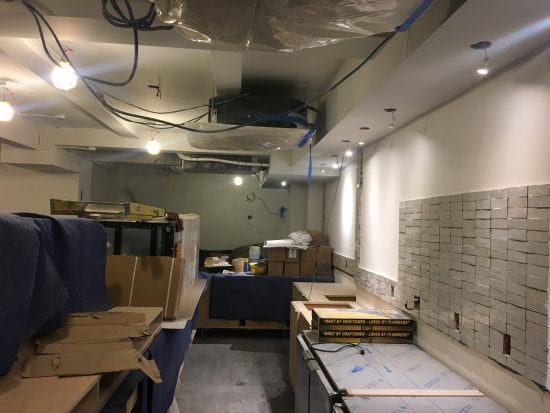
Selim, who has designed a number of restaurant spaces, says he actively pursued creating coffee shops. “I love designing for coffee roasters because of their avant-garde spirit and their connection to earth and remote coffee farmers. In my craft, I can find creative forms of expression for this identity.”
As community hubs, coffee shops have a unique opportunity to use their physical space to represent shared values and identity. For many of Selim’s clients, this is likely to mean clean lines, sturdy Scandinavian furniture, and stone. For others, it might mean communal tables and ample natural light, and for others, it could look like bar-style seating and dark wood tones. Whatever the specifics, shop owners are becoming more and more willing to invest significant time, effort, and money into creating exactly what they want—and what they think their guests will want—in their cafes.
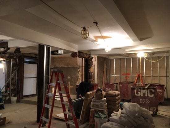
Selim says that his own personal goal in coffee shop design is to “create an artful, unique, and functional space that inspires and also comforts.” Noting the difficulty of this, he says it took him years to really feel like he had mastered balancing all three components. Getting one of these elements wrong—through things like bad lighting, a commercial-looking space, tasteless furniture, or having the wrong flow—can sink a cafe very easily, especially if there is competition around.
Setting a shop apart by getting the flow right is one of the biggest benefits of hiring an architect to design a space. It can be surprisingly tricky to manage the movement of baristas, cashiers, customers, products, and waste simultaneously while maintaining a visually compelling and comfortable environment. Selim says that creating a space equipped to streamline the flow of all those specific elements is his main focus in cafe design. Tellingly, he calls the movement of the baristas “choreography.”
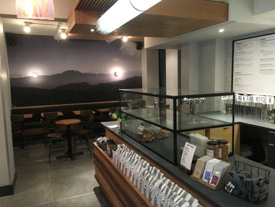
This is where it all comes together. In a great cafe, the baristas can be dancers and are dancers. In specialty coffee—and in craft of all kinds—form and function are not things to be separated. Proper function IS form. They are the same. A shop where people can move and feel free is beautiful. A cup of coffee that is delicious energizes you more completely than one that just has more caffeine. Details on buildings help them serve us better because they keep us engaged, inspired, and aware. Function and form are one. This is why specialty coffee exists and will continue to flourish. May we who understand this continue to develop our relationships with people from other disciplines who have the same vision.
 ABOUT THE AUTHOR
Joshua Dusk-Peebles is a lifelong explorer, experimenter, and learner. He enjoys nothing more than sharing what he is learning with other people. When he was young, he would get legitimately angry if his dad forgot to let him smell the coffee every time a new bag was opened. Unfortunately, the much less pleasant corresponding beverage kept him away from coffee until his 30s, when he smelled and then tasted a well-handled natural process Ethiopia Yirgacheffe, and everything made sense again. He plans on getting his own newborn son started much sooner. He can be reached at dusk.peebles@yahoo.com or found online at duskcoffee.com.

